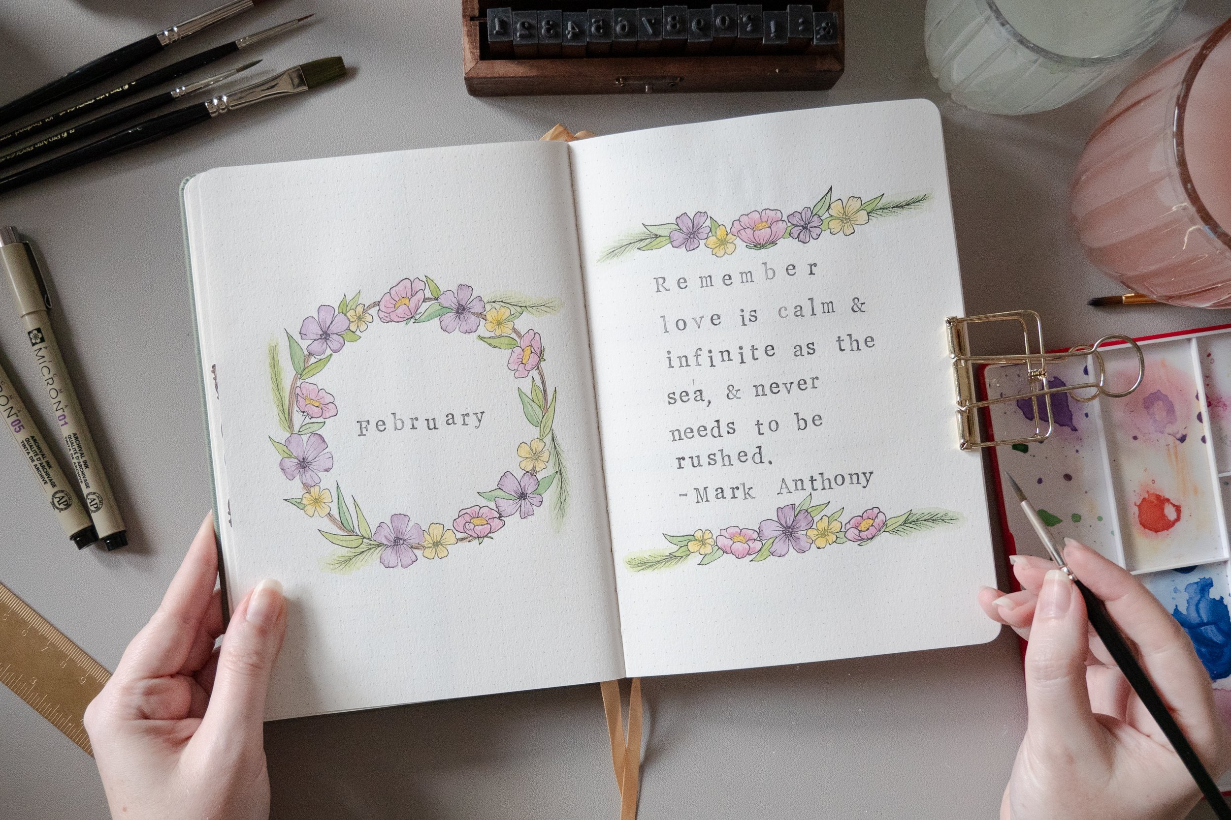
February 2024 Delicate Floral Watercolour Bullet Journal
This pastel colour palette. These delicate floral motifs. This minimalistic stamped lettering. I’m SO excited to jump into my February bullet journal, and proud that I’ve managed to pull off this watercolour-decorated layout!
Check out the video below to watch it come to life, or scroll down to see photos and find links to everything I used to make this a reality.
Cover Page & Quote Page
When I’m not sure what to do for a cover page, the name of the month inside a wreath is one of my go-to designs. It’s pretty easy to pull off - even more so if you use stamps to add your lettering like me! I opted for a grey Tombow for the lettering, to keep things nice and soft, but I think black would have looked lovely too.
I chose a quote about love, since February is the month of Valentines’ Day. This one is from Mark Anthony. I messed up the spacing on the last line of the poem a little, whoops! But I can live with it!
Calendar Spread
I’m loving my open calendar, with watercolour bars in the same shades as my florals! I’ve added just a touch of decoration to wrap around the corners of the calendar, but I wanted to keep plenty of negative space throughout this entire setup too.
Content Planner Spread
I love to have space to plan my month out as far as scheduled Instagram posts, planning for Youtube videos and sometimes scheduling Shorts ahead of time too. That said - this is just a vertically-oriented calendar layout, so it could be used for plenty of other things too! A study or assignment tracker, a regular calendar, a time management tool, a reading log, a meal planner or workout tracker - the possibilities are endless.
My Dutch Door/Fold-Out Weekly Dashboard Frankenstein System
My new approach to weeklies is evolving with each passing month! Back in December I opted for a dashboard with Dutch Doors for the first time - the idea being I wanted to keep my habit and mood trackers visible throughout the month from my weeklies. I always use my weeklies, but I’d been neglecting my trackers so this was to try to avoid the “out of sight, out of mind” phenomenon. And it worked!
But in January, I felt like my weeklies weren’t very pretty - and that made me not want to use them. So this time, I’ve factored in more space for decoration, and instead of cutting down the centre pages to make Dutch Doors, I’ve folded them in half to make flaps - which I can decorate on live stream with you guys soon! I also used the inside of those weekly flaps to house my Spending Log, which will also hopefully help me remember to use it more!
Everything I Used to Make this Journal Theme:
• Mellow Days Rêverie Sage watercolour dot grid journal
• Sakura Pigma Micron 05 pen
• Sakura Pigma Micron 01 pen
• Alphabet letter stamps *
• Tombow dual brush pen N79 warm grey
• Faber-Castell 36 colour watercolor set *
• Watercolour round brush set
• Mechanical pencil *
• Kneadable eraser *
* = gifted


