5 Easy Reading & Book Tracker Ideas for Your Journal
Keen to start a reading journal, or include reading tracking pages in your bullet journal? You’ve come to the right place! I’m sharing five different ways to track reading in a dot grid journal, complete with dimensions and tips on decorating your pages. Some of these options are comprehensive, with room to track data like format and dates read, while others are simple and fuss-free. Let’s begin!
Below you can watch a video where I set these pages up, which you can follow along with if you like - or you can scroll on for photos and a blurb on each idea.
All the layouts I’m sharing in this post were set up in an A5 journal from Archer & Olive, which has 38 dot grid spaces vertically (or 39 dots) and 26 dot grid spaces horizontally (or 27 dots). If you’re also using an A5 dot grid journal it’s likely you can copy these exactly! Just check to make sure your page has the same dot dimensions first - some journals have a different number of dots to each page. If you’re using a different sized journal, you might need to adapt the layouts to fit your journal.
I’ll also link to the items I used to make these pages where possible - just know those links might be affiliate links, so I might make a small commission if you make a purchase using my links. Items marked with * were gifted.
Reading Tracker 1: The Two-Column List Layout
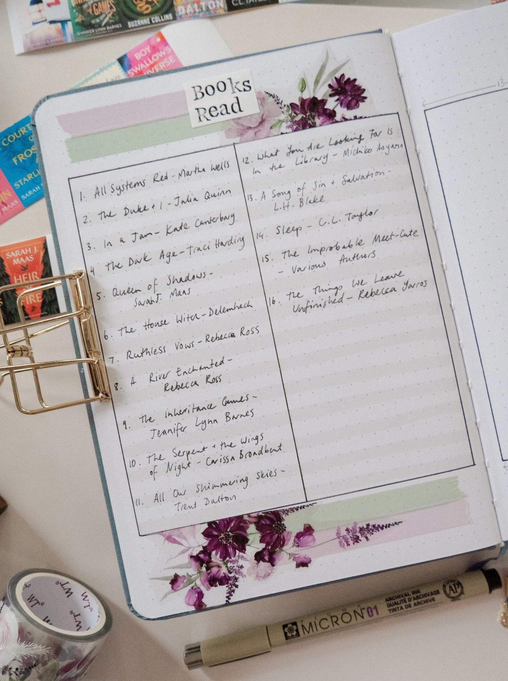
This one is about as fuss-free as it gets - and you know I love it, because it’s the layout I use in my own reading journal! It’s truly just a list of the books you’ve finished, in order, and you can add to it as often as you like. I split mine into two columns to get more bang-for-your-buck page efficiency, but you could alter this to be just one big box with your title and author on a single line if you’d prefer - or potentially even stretch it out into three columns per page if you’re using a square or B5 journal!
For this layout, I’ve started five dot grid spaces (or six dots) from the top of the page, and the bottom line is also five spaces from the bottom of the page. I took my functional column design’s vertical lines all the way out to the last dots on the left and right of the page, and added a very light highlight on every second horizontal line with a very light grey marker.
This spacing means we have a nice little strip of space at the top and bottom for decoration! I love layering two solid washi tapes with a little pop of a complementary PET tape for a very quick and easy theme - and if your PET tape designs are too big for the space, you can always cut them in half and stack the cut edge right against the lines of your book tracker box, as I’ve done here.
In this layout I used solid washi tapes from Journalsay and the Violet Bliss PET tape* from the Washi Tape Shop. I’m using a Sakura Pigma Micron 05 fineliner* for all the lines in this setup - it’s a wonderful waterproof pen that doesn’t smudge easily, and you can colour over it with water-based markers or erase pencil lines around it immediately after drawing a line without smearing the ink! I also used my letter stamp set* on some sticker paper for the header.
Reading Tracker 2: Book Covers, Data & Ratings Layout
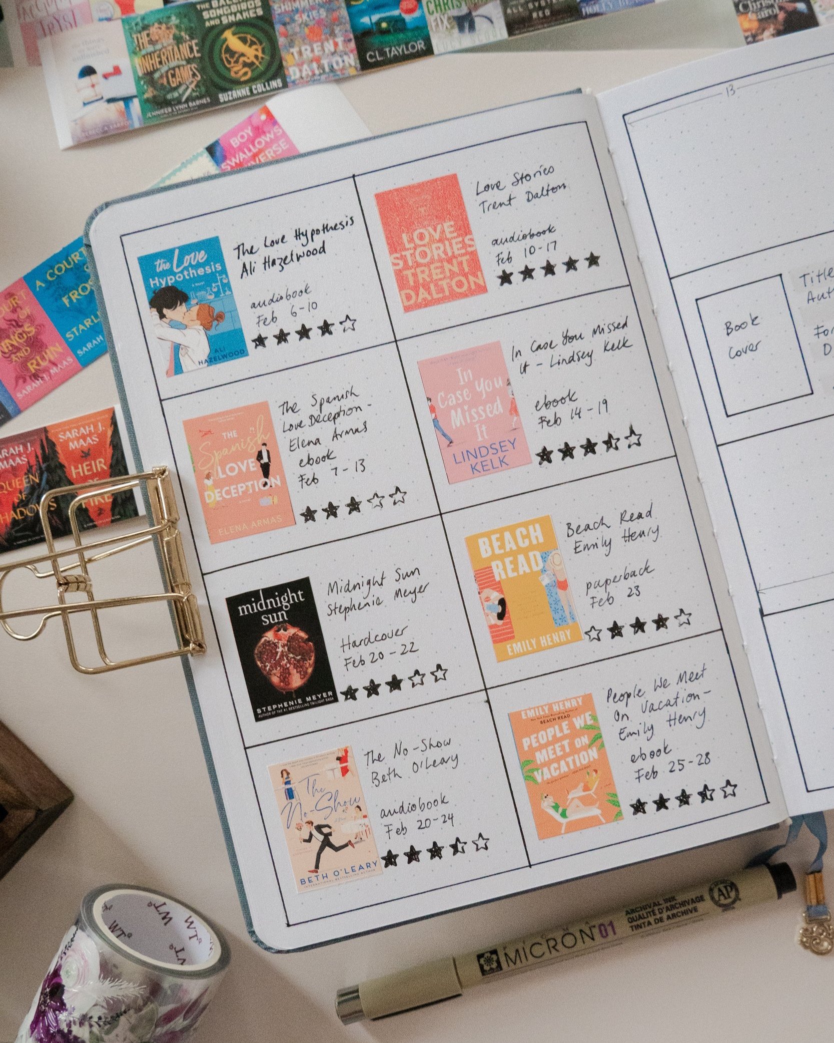
Pretty much a big grid! This one works wonderfully for data-lovers who like to record a bit more information about their reads - like a star rating, dates read, and the format they read the book in. It also leaves a little gap around the book covers, so they don’t need to be the exact same size every time to fit the space. That can be handy!
I haven’t left any blank boxes around the outside of this layout - it takes up the whole page. Each box that houses a book and its data is 9.5 spaces tall - so a couple of the horizontal lines actually sit in between the dots, rather than on top of them. The centre vertical line is in the middle of the page at 13 spaces from the left or right edge. If you want to get technical, my book covers here are 4.5 spaces wide by 6.5 spaces tall.
This is another simple layout, and doesn’t leave any page space for decoration. If you like to include some extra pretty stuff on your pages, you could always make the boxes of the grid a little smaller to allow some space to decorate outside of the lines, or even remove a row and just track six books to a page to give yourself even more space.
I printed my book covers on sticker paper with my home inkjet printer after downloading them from Goodreads and sizing them in Microsoft Word. I cut them out with a straight-edge guillotine tool and my favourite scissors *. I bought my star rating stamp on Etsy, but you can get a similar one in this set from Notebook Therapy. I use it with a black ink pad sometimes, or a black Tombow marker sometimes too - I just colour in the stamp with the brush tip pen and then stamp that ink onto the page.
Reading Tracker 3: Ten At A Time - A List With Stats
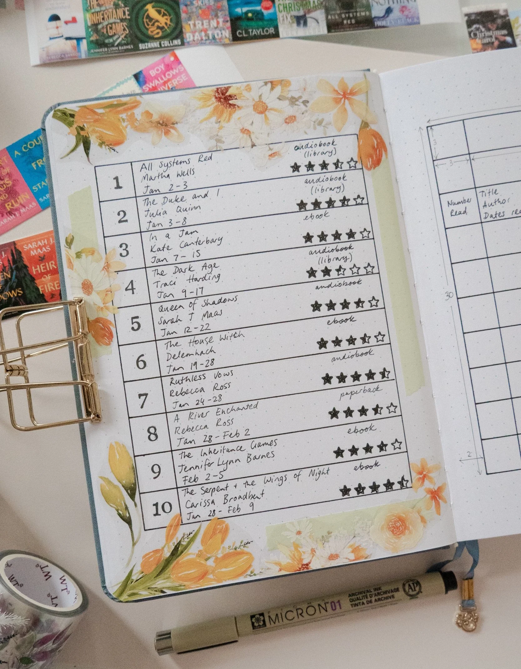
This tracker is a variation on a list layout that gives it some extra stat-tracking juice. I borrowed this layout from Amanda of @books_ergo_sum - she tracks her books 10 at a time, so whenever the need arises she adds another one of these pages. Genius!
This layout features a narrow left column for the number, in case you like to know how many books you’ve read, and a wider right column for the book title, the author, your star rating, and any other information you might like to track. I’ve included the dates read and format for my example page, but you could add anything else you like - year of publication, genre, page count - the possibilities are endless! It also leaves plenty of room for decoration, and it’s set up in a way that means long book titles can be easily accommodated. A great thing about this page layout is that you can completely set it up in advance and fill it in as you go.
I’ve started my layout four grid spaces from the top of the page and two grid spaces from the left and right edges. I’ve also left four grid spaces underneath. This leaves just enough room for a strip of thin washi on the vertical edges, and some chunkier decoration at the top and bottom. The book info boxes are 19 spaces wide and three spaces tall, and the number column is also three spaces wide, so each number area is a small square. My star rating stamp takes up one vertical dot grid space by about six horizontal dot grid spaces, in case you were wondering!
Much like earlier, I used solid washi tapes from Journalsay and the Golden Blossoms PET tape* from the Washi Tape Shop to decorate this page, as well as my letter stamp set* for the numbers in the left column, and my star rating stamp from Etsy.
Reading Tracker 4: A Whole Cover + Rating MOMENT
This is SUCH a visually impactful way to track your reads! I use a version of this in my monthly reading journal setups, but it can work really well as an annual spread for those of us who read somewhere in the realm of 12-25 books a year, or as a “hall of fame” to feature only your favourites if you read a LOT. You can also expand it out to several consecutive spreads if you’d like to!
It doesn’t leave any room for extra data, but it’s a wonderful fuss-free reading tracker if you love to feature book covers on your layouts. I’ve teamed mine up with my handy star rating stamp, but you could use star rating stickers or draw your own stars, or if you aren’t worried about remembering how much you liked a book, you could skip the star rating altogether. I use the CAWPILE rating system, so I also add the CAWPILE score I give each book on this spread in my own journal too!
The first row of book covers starts 5 dot grid spaces from the top of the page, and the outside books are lined up with the last row of dots on the left and right. Each book area is 5 spaces wide by 7 spaces tall, and I’ve allowed two dot grid spaces between each book cover. I left one space underneath each cover before adding the star rating stamp, and another two spaces after the star rating stamp before starting the next row of books. The bottom of the page has two empty dot grid spaces after the last row of star ratings.
I printed my book covers on sticker paper with my home inkjet printer after downloading them from Goodreads and sizing them in Microsoft Word. I cut them out with a straight-edge guillotine tool and my favourite scissors *. I bought my star rating stamp on Etsy, but you can get a similar one in this set from Notebook Therapy. I use it with a black ink pad sometimes, or a black Tombow marker sometimes too - I just colour in the stamp with the brush tip pen and then stamp that ink onto the page. And I lined the top and bottom of the page with some floral patterned washi *- it’s tricky to find the exact set, but here’s a similar one!
Reading Tracker 5: The Illustrated Bookshelf
I promise this tracker isn’t as complicated to set up as it seems! It’s a wonderful option for those of us who read mostly digitally - it allows you to have a bookshelf that takes up no space in your home. It doesn’t allow for a lot of writing space - I typically can only fit the book title on the spines of my little books - but it does give you a sneaky tracking option that you might not realise at first glance!
For the setup - we’ll start with the shelves. Each shelf is just one space tall and 22 spaces wide. I’ve set them in two dot grid spaces from the page edges, and left six dot grid spaces vertically between each shelf - including the top shelf from the top of the page. The bottom shelf is is three dot grid spaces from the bottom of the page. I drew my shelves with a ruler but you could freehand them too!
Then we add the books. These are just rectangles, so they’re very easy to draw! I’ve freehanded my books, and deliberately varied the height and width of them to help them look more true to life. On average, I’ve made my books about one to 1.5 spaces wide, and about 4.5 spaces tall. I’ve stood some of my books up, laid some down on their sides, and tipped a few over so they’re resting diagonally on the books next to them. Those are the trickiest ones to draw - try to make sure your diagonal books still have right angles in all their corners!
I’ve also deliberately left some gaps for “decor” on my floating shelves, and added stickers to fill those in. You could use stamps or doodle your decor instead, or just fill the shelves completely with books.
I’m using a Sakura Pigma Micron 05 fineliner* for all the lines in this setup - it’s a wonderful waterproof pen that doesn’t smudge easily, and you can colour over it with water-based markers or erase pencil lines around it immediately after drawing a line without smearing the ink! The stickers I used to decorate are from STICKII’s Herb Studies* and Quaint Kitchen * sticker sheets.
If you have an existing theme you want your books to tie into, you can colour the spines in to match that theme (and in advance, if you like). If you prefer, you can colour the covers as you go to match the colour of the actual book cover art. Or if you want to be very clever, you can use the colour of the book spines as a form of tracker! So for instance, in this example let’s say I’m tracking the format I read each book in.
The green might represent ebooks, the light grey might represent audiobooks, the dark grey for paperbacks and the brown for hard covers. You could switch that to anything else you prefer - a genre tracker, an indication of page count, or even the star rating you give each book! Just make sure you tuck a key under the bottom shelf so you know which colours you picked to track what, in case future-you wants to refer back to them later.
I also like to add a subtle number at the far right of each shelf that lets me know how many books I’m up to if I’ve filled the shelf. You can add individual numbers onto the shelf itself underneath each book if you’re using this as a reading goal page as well as a tracker. This page has room to track 51 books!


